8.1 A simple model
Lets take a look at the simulated dataset sim1, included with the modelr package. It contains two continuous variables, x and y. Let’s plot them to see how they’re related:
library(ggplot2)
library(modelr)
ggplot(sim1, aes(x, y)) +
  geom_point()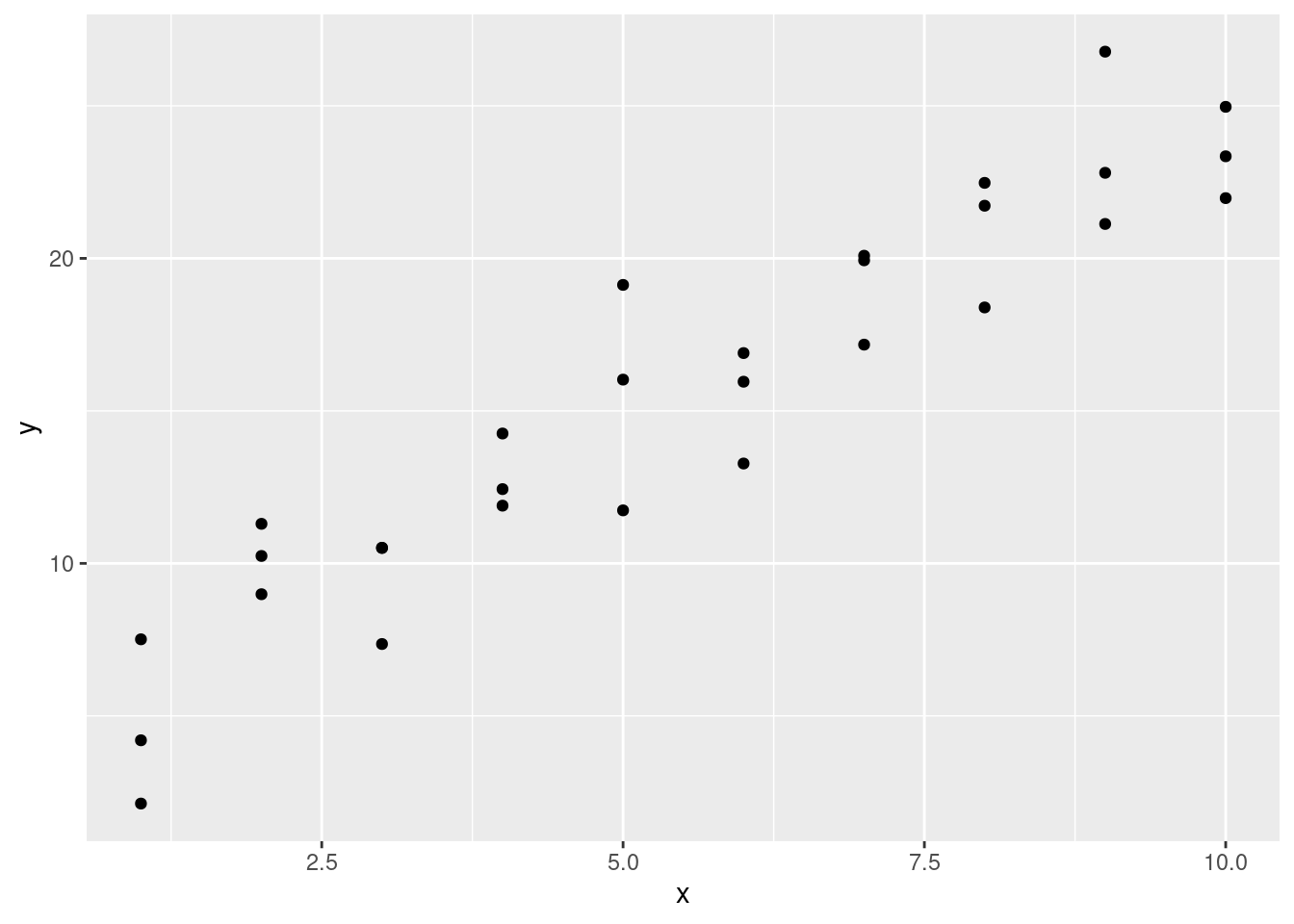
You can see a strong pattern in the data. Let’s use a model to capture that pattern and make it explicit.
It’s our job to supply the basic form of the model. In this case, the relationship looks linear, i.e. y = a_0 + a_1 * x. Let’s start by getting a feel for what models from that family look like by randomly generating a few and overlaying them on the data. For this simple case, we can use geom_abline() which takes a slope and intercept as parameters. Later on we’ll learn more general techniques that work with any model.
models <- data.frame(
  a1 = runif(250, -20, 40),
  a2 = runif(250, -5, 5)
)

ggplot(sim1, aes(x, y)) +
  geom_abline(aes(intercept = a1, slope = a2), data = models, alpha = 1/4) +
geom_point() 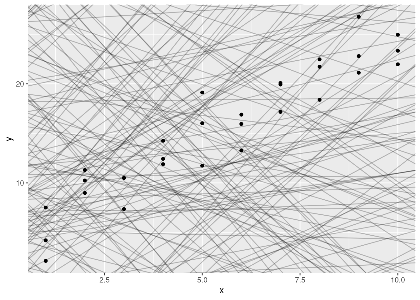
There are 250 models on this plot, but a lot are really bad! We need to find the good models by making precise our intuition that a good model is “close” to the data. We need a way to quantify the distance between the data and a model. Then we can fit the model by finding the value of a_0 and a_1 that generate the model with the smallest distance from this data.
One easy place to start is to find the vertical distance between each point and the model, as in the following diagram. (Note that I’ve shifted the x values slightly so you can see the individual distances.)
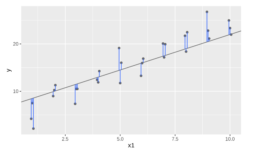
This distance is just the difference between the y value given by the model (the prediction), and the actual y value in the data (the response). To compute this distance, we first turn our model family into an R function. This takes the model parameters and the data as inputs, and gives values predicted by the model as output:
model1 <- function(a, data) {
  a[1] + data$x * a[2]
}
model1(c(7, 1.5), sim1)
## [1] 8.5 8.5 8.5 10.0 10.0 10.0 11.5 11.5 11.5 13.0 13.0 13.0 14.5 14.5 14.5
## [16] 16.0 16.0 16.0 17.5 17.5 17.5 19.0 19.0 19.0 20.5 20.5 20.5 22.0 22.0 22.0Next, we need some way to compute an overall distance between the predicted and actual values. In other words, the plot above shows 30 distances: how do we collapse that into a single number?
One common way to do this in statistics to use the “root-mean-squared deviation.” We compute the difference between actual and predicted, square them, average them, and the take the square root. This distance has lots of appealing mathematical properties, which we’re not going to talk about here. You’ll just have to take my word for it!
measure_distance <- function(mod, data) {
  diff <- data$y - model1(mod, data)
  sqrt(mean(diff ^ 2))
}
measure_distance(c(7, 1.5), sim1)
## [1] 2.665212Next, let’s overlay the 10 best models on to the data. I’ve coloured the models by -dist: this is an easy way to make sure that the best models (i.e. the ones with the smallest distance) get the brighest colours.
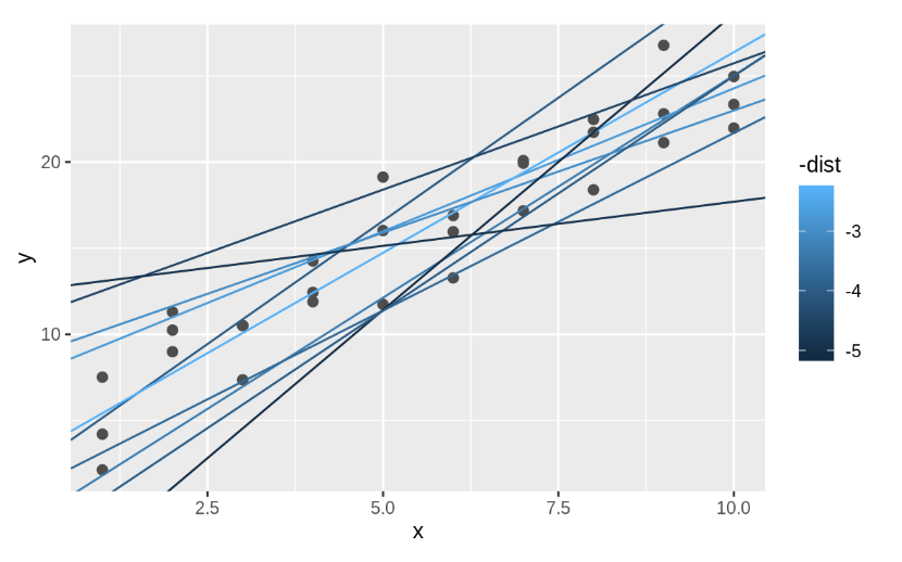
We selected the 10 best models out of 250 randomly generated. We will see next week that there is an easy method to find an “optimal” model. Here we use the function optim to find it, but do not worry about the details of this.
best <- optim(c(0, 0), measure_distance, data = sim1)
best$par
## [1] 4.222248 2.051204ggplot(sim1, aes(x, y)) +
geom_point(size = 2, colour = "grey30") +
geom_abline(intercept = best$par[1], slope = best$par[2])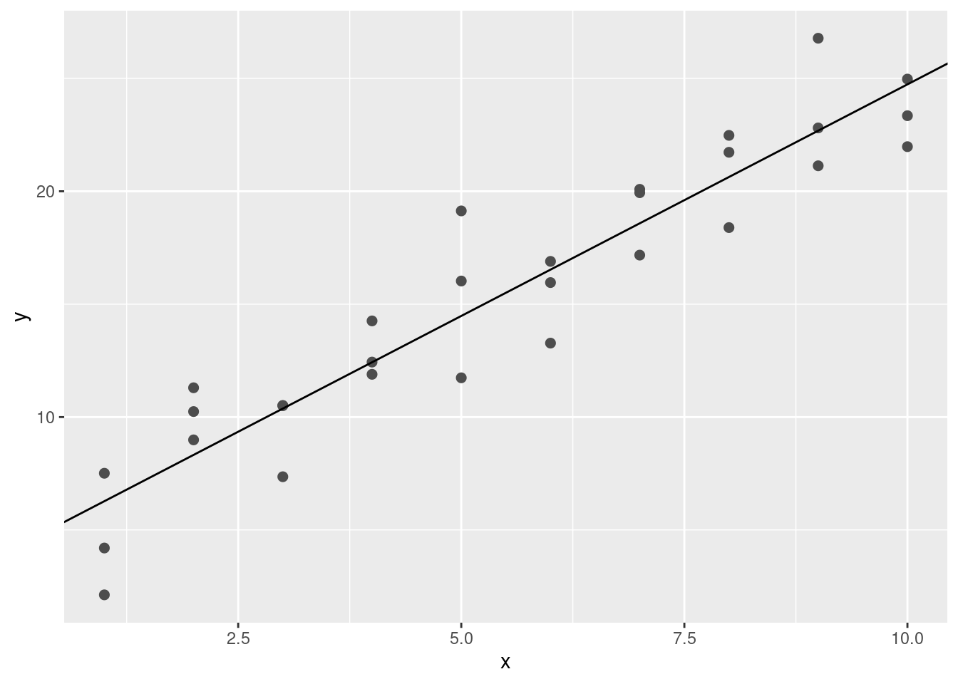
The line gives the so-called fitted or predicted values, which give us the signal that the model managed to capture from the data.
It’s also useful to see what the model doesn’t capture, the so-called residuals which are left after subtracting the predictions from the data. Residuals are powerful because they allow us to use models to remove striking patterns so we can study the subtler trends that remain.
The residuals are just the distances between the observed and predicted values that we computed above.
fitted <- best$par[1] + best$par[2]*sim1$x
sim1$resid <- sim1$y - fitted

ggplot(sim1, aes(x, resid)) +
  geom_ref_line(h = 0) +
geom_point() 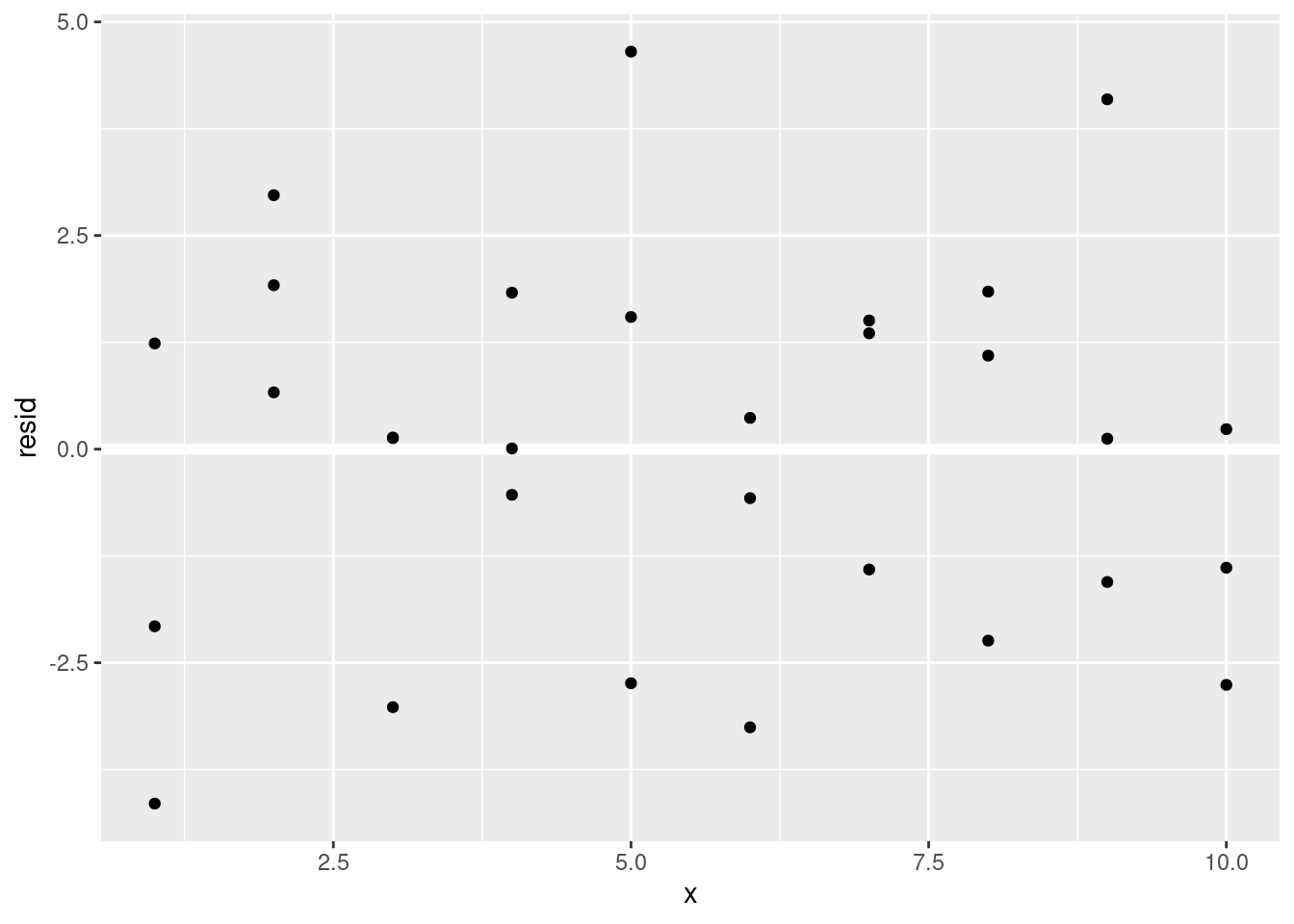
This looks like random noise, suggesting that our model has done a good job of capturing the patterns in the dataset.