8.2 Models as functions
The concept of a function is very important when thinking about relationships. A function is a mathematical concept: the relationship between an output and one or more inputs. One way to talk about a function is that you plug in the inputs and receive back the output. For example, the formula \(y = 3x + 7\) can be read as a function with input \(x\) and output \(y\). Plug in a value of \(x\) and receive the output \(y\). So, when \(x\) is 5, the output y is 22.
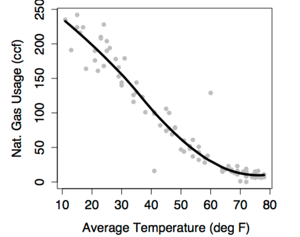
One way to represent a function is with a formula, but there are other ways as well, for example graphs and tables. The figure below shows a function representing the relationship between gas usage and temperature. The function is much simpler than the data. In the data, there is a scatter of usage levels at each temperature. But in the function there is only one output value for each input value.
Some vocabulary will help to describe how to represent relationships with functions.
The response variable is the variable whose behavior or variation you are trying to understand. On a graph, the response variable is conventionally plotted on the vertical axis.
The explanatory variables are the other variables that you want to use to explain the variation in the response. The previous figure shows just one explanatory variable, temperature. It’s plotted on the horizontal axis.
Conditioning on explanatory variables means taking the value of the explanatory variables into account when looking at the response variables. When you looked at the gas usage for those months with a temperature near 49°, you were conditioning gas usage on temperature.
The model/fitted/predicted value is the output of a function. The function – called the model function – has been arranged to take the explanatory variables as inputs and return as output a typical value of the response variable. That is, the model function gives the typical value of the response variable conditioning on the explanatory variables. The function shown in the previous figure is a model function. It gives the typical value of gas usage conditioned on the temperature. For instance, at 49°, the typical usage is 65 ccf. At 20°, the typical usage is much higher, about 200 ccf.
The residuals show how far each case is from its model value. For example, one of the cases plotted in Figure 6.2 is a month where the temperature was 13° and the gas usage was 191 ccf. When the input is 13°, the model function gives an output of 228 ccf. So, for that case, the residual is 191 - 228 = -37 ccf. Residuals are always “actual value minus model value.”
This way, the idea of a function is fundamental to understanding statistical models. Whether the function is represented by a formula or a graph, the function takes one or more inputs and produces an output. The output is the model value, a “typical” or “ideal” value of the response variable at given levels of the inputs. The inputs are the values explanatory variables.
The model function describes how the typical value of the response variable depends on the explanatory variables. The output of the model function varies along with the explanatory variables. For instance, when temperature is low, the model value of gas usage is high. When temperature is high, the model value of gas usage is low. The idea of “depends on” is very important.
The model function describes a relationship. If you plug in values for the explanatory variables for a given case, you get the model value for that case. The model value is usually different from one case to another, at least so long as the values of the explanatory variables are different. When two cases have exactly the same values of the explanatory values, they will have exactly the same model value even though the actual response value might be different for the two cases.
The residuals tell how each case differs from its model value. Both the model values and the residuals are important. The model values tell what’s typical or average. The residuals tell how far from typical an individual case is likely to be.
Models explain the variation in the response variable. Some of the variability is explained by the model, the remainder is unexplained. The model values capture the “deterministic” or “explained” part of the variability of the response variable from case to case. The residuals represent the “random” or “unexplained” part of the variability of the response variable.
8.2.1 Model Functions with Multiple Explanatory Variables
Historically, women tended to be paid less than men. To some extent, this reflected the division of jobs along sex lines and limited range of jobs that were open to women – secretarial, nursing, school teaching, etc. But often there was simple discrimination; an attitude that women’s work wasn’t as valuable or that women shouldn’t be in the workplace. Over the past thirty or forty years, the situation has changed. Training and jobs that were once rarely available to women – police work, management, medicine, law, science – are now open to them.
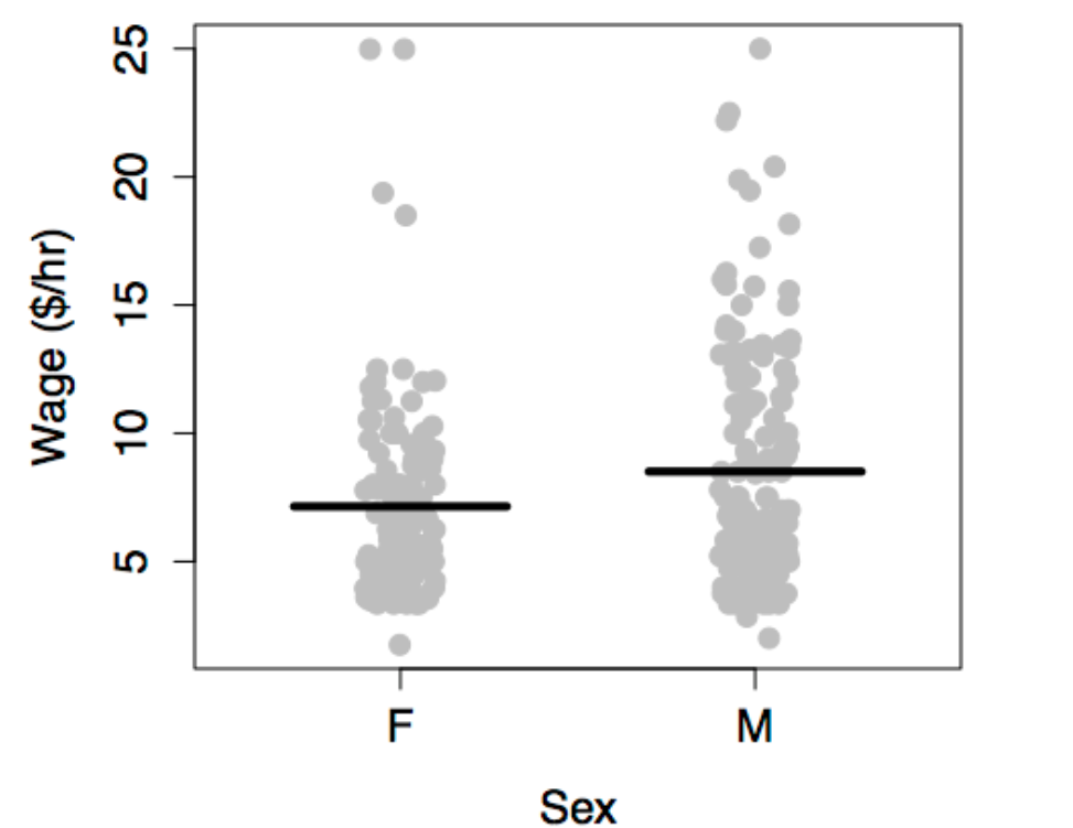
Surveys consistently show that women tend to earn less than men: a “wage gap.” To illustrate, consider data from one such survey, the Current Population Survey (CPS) from 1985. In the survey data, each case is one person. The variables are the person’s hourly wages at the time of the survey, age, sex, marital status, the sector of the economy in which they work, etc.
One aspect of these data is displayed by plotting wage versus sex. The model plotted along with the data show that typical wages for men are higher than for women.
The situation is somewhat complex since the workforce reflected in the 1985 data is a mixture of people who were raised in the older system and those who were emerging in a more modern system. A woman’s situation can depend strongly on when she was born. This is reflected in the data by the age variable.
There are other factors as well. The roles and burdens of women in family life remain much more traditional than their roles in the economy. Perhaps marital status ought to be taken into account. In fact, there are all sorts of variables that you might want to include – job type, race, location, etc. A statistical model can include multiple explanatory variables, all at once. To illustrate, consider explaining wage using the worker’s age, sex, and marital status.
In a typical graph of data, the vertical axis stands for the response variable and the horizontal axis for the explanatory variable. But what do you do when there is more than one explanatory variable? One approach, when some of the explanatory variables are categorical, is to use differing symbols or colors to represent the differing levels of the categories. The figure below shows wages versus age, sex, and marital status plotted out this way.
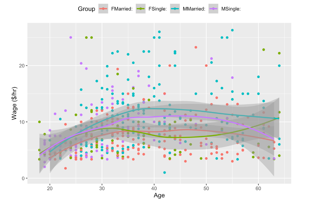
The first thing that might be evident from the scatter plot is that not very much is obvious from the data on their own. There does seem to be a slight increase in wages with age, but the cases are scattered all over the place.
The model, shown as the continuous curves in the figure, simplifies things. The relationships shown in the model are much clearer. You can see that wages tend to increase with age, up until about age 40, and they do so differently for men and for women and differently for married people and single people.
Models can sometimes reveal patterns that are not evident in a graph of the data. This is a great advantage of modeling over simple visual inspection of data. There is a real risk, however, that a model is imposing structure that is not really there on the scatter of data, just as people imagine animal shapes in the stars. A skeptical approach is always warranted.